

I also collected feedback on audio by asking a few people what they think is good and bad about my magazine production:
Overall, according to my audience feedback, my strengths are that all three media products use an appropriate colour scheme for the genre of hip hop and the font on the cover and contents page is clear and easy to read.
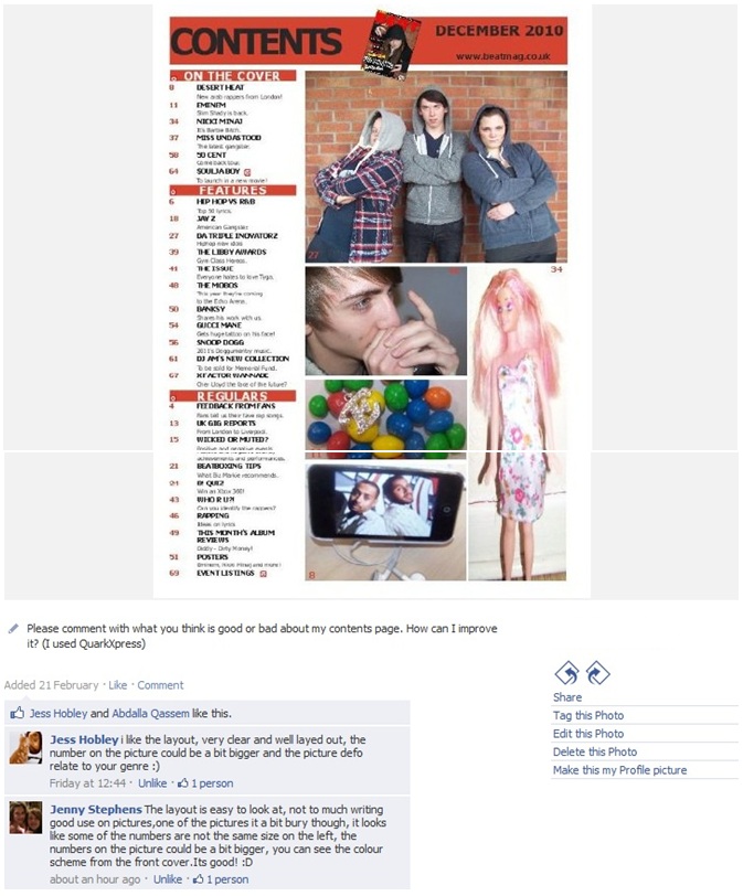
However, my audience suggested that there a few weaknesses in my production. For the front cover, they said that the brick wall in the background of the image needed to have some sort of editing, one person suggested I could make the outline of the bricks yellow. Also, the coverlines look a bit flat on the page, so to improve, I could add a shadow effect to the coverlines. For the contents page, my disadvantages are that some of my images are of poor quality and that the number on the images are too small.
In addition, the main problem with my double page spread is that the standfirst is too small, I should've made it longer so it can almost complete the layout of professional magazine articles. Although, my audience like the way my main image blends with the background of the first page of the article.
No comments:
Post a Comment