Introduction:
For the main task I produced the front cover, contents page and double page spread of a new music magazine. I have chosen the genre of hip hop and used a variety of different technologies such as Prezi, Movie Maker, Slideshare, etc. to present my research and feedback.
Saturday 26 March 2011
Friday 25 March 2011


Thursday 24 March 2011
Preliminary Exercise
Introduction:
For the premlinary exercise, I used DTP and an image manipulation program to produce the front cover and contents page of a school magazine. My front cover featured a photograph of a astudent in medium close up and some appropriately laid-out text and a masthead. I also used QuarkXpress to produce my contents page.
For the premlinary exercise, I used DTP and an image manipulation program to produce the front cover and contents page of a school magazine. My front cover featured a photograph of a astudent in medium close up and some appropriately laid-out text and a masthead. I also used QuarkXpress to produce my contents page.
Wednesday 23 March 2011


Tuesday 22 March 2011
Evaluation
For my evaluation, I answered 7 questions about my music magazine production, using different methods of presenting my answers on my blog. These methods vary from PowerPoint presentations to audio and video clips.
Monday 21 March 2011
In what ways does your media product use or develop the codes and conventions of real media products?
I presented the answer to this question using Prezi.com.
Sunday 20 March 2011
Saturday 19 March 2011
Friday 18 March 2011
Who would be the audience for your media product?
Audience Profile 1:

Name: Alexander Smith
Gender: Male
Job: Shop assistant
Age: 19
Relationship status:
In a relationship
Likes:
>> WWE RAW.
>> WWE RAW.
>> Fave rapper is Jay Z.
>> Playing football.
Fave song: JayZ - 99 Problems
Audience Profile 2:

Name: Briony Blake
Gender: Female
Gender: Female
Job: Home & Bargain
Age: 16
Relationship status:
In a relationship.
Likes:
>> Reading.
>> Reading.
>> Shopping.
>> Fave rapper is Eminem.
Fave Song: Eminem- Loose Yourself
>> Fave rapper is Eminem.
Fave Song: Eminem- Loose Yourself
Thursday 17 March 2011
Wednesday 16 March 2011
Tuesday 15 March 2011
Thursday 17 February 2011
Audience Feedback
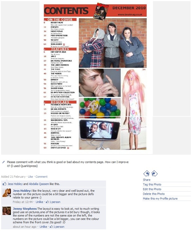
For this task, I asked for feedback from my target audience by sharing my music magazine production on a social networking site, facebook. I asked them to comment what they think my strengths and weeknesses are of my magazine front cover, contents page and double page spread:


I also collected feedback on audio by asking a few people what they think is good and bad about my magazine production:
Overall, according to my audience feedback, my strengths are that all three media products use an appropriate colour scheme for the genre of hip hop and the font on the cover and contents page is clear and easy to read.
However, my audience suggested that there a few weaknesses in my production. For the front cover, they said that the brick wall in the background of the image needed to have some sort of editing, one person suggested I could make the outline of the bricks yellow. Also, the coverlines look a bit flat on the page, so to improve, I could add a shadow effect to the coverlines. For the contents page, my disadvantages are that some of my images are of poor quality and that the number on the images are too small.
In addition, the main problem with my double page spread is that the standfirst is too small, I should've made it longer so it can almost complete the layout of professional magazine articles. Although, my audience like the way my main image blends with the background of the first page of the article.
Monday 14 February 2011
Screen Grabs of Double Page Spread
Before I started making my double page spread, I made changes to the main image. I had to remove the 59 Fifty sticker from the cap. Therefore I used Photoshop to do this.
I also used Photoshop to create a collage of dollar signs.


Following this, I also created another dollar collage image, but added the microphone to it.


I also used Photoshop for the title as I wanted to reverse the letter 'E' in Eminem's name.
After making these changes on Photoshop, I began to produce my double page spread on QuarkXpress.
 |
Firstly after opening the image on photoshop, I used the “Polygonal lasso tool” to select a circle around the sticker. |
 |
After that I clicked the delete button and moved the selected layer to the left of the cap. Then i right clicked the cap and clicked “Layer via copy”. |
 |
After that I clicked back on the move tool and moved a copy of part of the cap to the gap where the sticked was. |
 |
Here I started to blend this part of the cap with the rest of the cap. I used the brush tool to outline around the shape with the same shade green. I used the 'eyedropper tool' to indicate the colour. |
 |
My final step was to blend all the colours together so that the cap looks natural. I used the 'smudge tool' for this. |


I also used Photoshop for the title as I wanted to reverse the letter 'E' in Eminem's name.
 |
| Firstly, I used the 'Horizontal Type tool' to write the name Eminem. The font is Tahoma, bold and is 60 pt. |
 |
| The second layer is of the letter 'E'. Again, I used the 'Horizontal type tool' to do this and the font style and size is the same as the first layer. In order to reverse the letter. I clicked 'Ctrl T' and I reversed it. |
 |
| Here I deleted the 'E' and 'M' from the first layer and using the 'move tool', I moved the reversed letter 'E' down next to the first layer. |
 |
| My final step create another layer with the letter 'M' to complete the name. Therefore, I used the 'Horizontal type tool' for this. After that, I linked all three layers by highlighting them in the layers box and right clicked them and clicked 'link layers'. |
After making these changes on Photoshop, I began to produce my double page spread on QuarkXpress.
 |
| I produced my double page spread article on page 3 and 4 of the QuarkXpress file. Firstly, I inserted 2 picture boxes using the 'Recangle Picture Box tool'. |
 |
| For each picture box, I imported the 2 pictures but made the image on the left a lighter colour by changing the capacity to 50% |
 |
| Here I created another picture box using the 'Rectangle Picture Box Tool', making sure the box is touching the blue guidelines and I imported the image of the title Eminem. |
 |
| I created another textbox here for the title, using the 'Rectangle text box tool' and I typed the title. I also created a shadow effect on the title. |
 |
| I added another textbox using the 'Rectangle text box tool' here and typed the standfirst in. |
 |
| For the article, I created a text box using the 'Rectangle Textbox tool' and imported the article, size 9pt. and I changed the number of columns to 3. After that I highlighted the first paragraph and went to 'Style', 'format' and ticked the Drop capital box. I also highlighed the first line and made it bold. |
 |
| I added the quote in the middle of the article here. Using the 'Rectangle Textbox tool', I inserted another textbox and typed the quote in it. I also added an effect to the letter E in the beginning of the title; shadow. |
 |
| I made the final changes here. I made the size of the first paragraph bigger than the rest of the article, and I made it bold. I also shortened the article and made it's size bigger. |
Saturday 12 February 2011
Screen Grabs of Contents Page
I used QuarkXpress to produce my Contents page:
 |
| To create a new QuarkXpress file, I clicked 'file', 'new project', changed the size to 'A4 Letter', ticked 'facing pages' and made the colums '3'. |
 |
| After clicking ok, I clicked Ctrl+O to fit the page in window and this appeared. It is the master page. |
 |
| On the top right hand of the screen, I dragged 3 more pages to the line, which is for the Contents page and double page spread. |
 |
| Using page 2 for the contents page, I started by inserting 3 red rectangles for the titles. I used the 'Rectangle Text Box Tool' and filled the 'Box Colour' red. |
 |
| On top of the red rectangles I inserted 4 more boxes to type the titles. The top rectangle, I wrote 'Contents', black, using the font Tahoma, size 48pt. The 3 other titles are 17pt. Tahoma and are white. |
 |
| Here I added the date and the email adress, using the 'Rectangle Text Box Tool'. The email adress is 12pt. and the date is 20pt. but they're both in black and are tahoma bold. |
 |
| I used the 'Rectangle Text Box Tool' and insterted 3 boxes for the actual content. The font colour I used was Black, 9pt, Tahoma and bold. but the sublines are Plain, 8pt. and the page numbers are in red, Tahoma, Bold. |
 |
| Using the 'Rectangle Picture Box Tool', I inserted 5 boxes, different sizes. |
 |
| I imported the pictures where the boxes are, however on some images, I had to make it fit the box, so I right clicked on it and clicked 'Scale Picture to box'. |
 |
| After importing all the images and using the 'Content tool' to move around in the image in the box to how I would like it to look, I inserted page numbers on the corners of each image. I made it 'Tahoma', 'bold' and 12pt. |
 |
| My final step, I inserted a smaller image of my font cover, on the top banner. I used the same tool: the 'Rectangle picture tool' for the image and imported the image. |
Thursday 10 February 2011


Wednesday 9 February 2011
Screen Grabs of front cover
I used Photoshop for the production of my front cover.
After this I made some changes and created a second draft.
I used Photoshop for the production of my front cover.
 |
| The first layer I added was the main image of my front cover. |
 |
Secondly, I made my main image bigger by clicking 'ctrl T' so that there wont be a big gap between the head and the title and I created the title of my magazine front cover using the 'Horizontal type tool'. I used the font 'Bauhaus 93' because it is simple and unique. |
 |
I’ve added the positioning statement and the coverlines here. They are in ‘Arial bold’. I’ve also set the text colour of the names of the bands and rappers to red and the description underneath in white. |
 |
| For my main coverline, I made a box using the 'Rectangle tool' and I've made the colour red. |
 |
This text is the only coverline which is black because it is the main coverline. Again, I used the 'Horizontal type' tool for this and the font type is 'Arial Bold', size 35 pt. |
 |
| Here I added the name of the rapper. It is white and the font is 'Arial bold' and is 45pt. |
 |
| In this step, I opened up an image of a barcode and dragged it on top of the front cover. Then I resized it by clicking 'Ctrl T' and moved it to the corner here. |
 |
Here I created a white rectangle on top of the barcode using the 'Rectangle tool'. |
 |
Using the 'Move tool' I moved the rectangle layer on top of the barcode and I used the 'Horizontal type tool' to type the date and adjusted it to on top of the white rectangle. |
 |
| Using the 'Horizontal type tool' I also added the price of the magazine next to the date. |
 |
Here I linked the barcode layer, the rectangle layer, the layer with the date and the layer with the price. I done this by highlighting all 4 layers, then right clicking them and clicking 'Link layers'. |
 |
I wanted to make the title seem like its behind the rappers head, so I made a copy of the main image layer by right clicking it and clicking on 'Duplicate layer'. Then I dragged it on top of the first layer and made the title layer in between the two layers like this and the title appeared invisible. |
 |
I highlighted the copied layer and used the 'Eraser tool' to erase around the head and where I want the title to appear. |
 |
This is how it looked after I erased the whole title area. |
 |
| Here I changed the size of the coverlines that are in white to 20pt using the 'Horizontal type tool'. |
 |
| I also made the size of the red rectangle smaller by clicking 'Ctrl T' and resizing it. |
 |
| I resized the barcode here by clicking 'Ctrl T'. |
 |
| I wanted to create an effect on the title here. So I clicked on the title layer, went on 'Layer' at the top, clicked 'Layer style' and clicked 'Blending Options. Then this box appeared and I ticked the boxes 'Drop shadow' and 'Inner Shadow'. |
 |
| Here I resized the positioning statement to 18pt and moved it further up the page, using the 'move tool'. I also made the title of the magazine bigger by clicking 'Ctrl T'. |
 |
| Part of the title was invisible so I refilled it by clicking on the copy of the main image layer and using the 'Eraser tool', I erased the area where the title should be and it appeared. This screen grab is during the process of refilling the title. |
 |
| I was unhappy with the title of the magazine, so I created an effect to it. I right clicked on the title layer and clicked 'Blending options' and ticked the boxes 'Drop shadow', 'Inner shadow', 'Bevel and Emboss' and 'Contour' and clicked ok. |
 |
| Here I stretched the coverline 'MISS UNDASTOOD' by clicking on its layer, then clicking the 'Character tool' in the top right of the screen and changed the 'Vertically scale' to 250% |
 |
Here I deleted the DESERT HEAT coverline and added a plus bar at the bottom of the cover. used the ‘Rectangle tool’ to create the bar and I set the colour to black. |
 |
I added the plus bar coverline here using the 'Horizontal type tool'. I changed the text colour of ‘PLUSE!’ to red and the size of it to 20pt and the rest of the coverline is white and is 14pt. |
 |
| Here I linked both layers (the plus bar coverline and the bar itself) and dragged it further down the page using the 'move tool'. |
 |
| I moved title down using the 'move tool' and made the positioning statement smaller by changing the size of it to 12pt, also dragged it using the 'move tool' so its under the title. |
 |
| Here I created a black Exclusive bar on top of the title using the 'Rectangle tool'. |
 |
| I added the Exclusive coverline here on top of the bar, using the 'Horizontal type tool'. The 'EXCLUSIVE INTERVIEW' is in red and size 20pt. and the rest of the coverline is white and is 14pt. Then I linked the bar with the coverline. |
 |
| Here I stretched title by clicking 'Ctrl T' and resizing it. Part of the title dissappeared, so I clicked on the layer1 copy and used the eraser tool to erase where the title should appear. |
 |
| I made the main coverline stand out more by adding another black box behind MISS UNDASTOOD and added a quote underneath using the 'Horizontal type tool'. |
 |
Changed the font colour of plus and exclusive to black. I made the box behind LATEST GANGSTA yellow and stretched it to fit box by changing the percentage to 150% on vertical scale. |
Subscribe to:
Posts (Atom)