Saturday, 19 March 2011
Friday, 18 March 2011
Who would be the audience for your media product?
Audience Profile 1:

Name: Alexander Smith
Gender: Male
Job: Shop assistant
Age: 19
Relationship status:
In a relationship
Likes:
>> WWE RAW.
>> WWE RAW.
>> Fave rapper is Jay Z.
>> Playing football.
Fave song: JayZ - 99 Problems
Audience Profile 2:

Name: Briony Blake
Gender: Female
Gender: Female
Job: Home & Bargain
Age: 16
Relationship status:
In a relationship.
Likes:
>> Reading.
>> Reading.
>> Shopping.
>> Fave rapper is Eminem.
Fave Song: Eminem- Loose Yourself
>> Fave rapper is Eminem.
Fave Song: Eminem- Loose Yourself
Thursday, 17 March 2011
Wednesday, 16 March 2011
Tuesday, 15 March 2011
Thursday, 17 February 2011
Audience Feedback
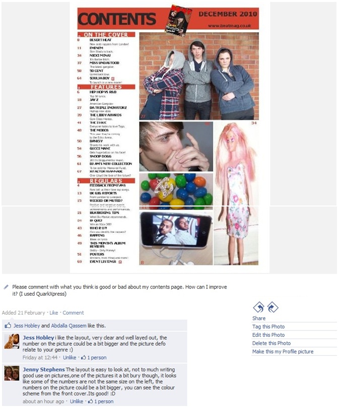
For this task, I asked for feedback from my target audience by sharing my music magazine production on a social networking site, facebook. I asked them to comment what they think my strengths and weeknesses are of my magazine front cover, contents page and double page spread:


I also collected feedback on audio by asking a few people what they think is good and bad about my magazine production:
Overall, according to my audience feedback, my strengths are that all three media products use an appropriate colour scheme for the genre of hip hop and the font on the cover and contents page is clear and easy to read.
However, my audience suggested that there a few weaknesses in my production. For the front cover, they said that the brick wall in the background of the image needed to have some sort of editing, one person suggested I could make the outline of the bricks yellow. Also, the coverlines look a bit flat on the page, so to improve, I could add a shadow effect to the coverlines. For the contents page, my disadvantages are that some of my images are of poor quality and that the number on the images are too small.
In addition, the main problem with my double page spread is that the standfirst is too small, I should've made it longer so it can almost complete the layout of professional magazine articles. Although, my audience like the way my main image blends with the background of the first page of the article.
Monday, 14 February 2011
Screen Grabs of Double Page Spread
Before I started making my double page spread, I made changes to the main image. I had to remove the 59 Fifty sticker from the cap. Therefore I used Photoshop to do this.
I also used Photoshop to create a collage of dollar signs.


Following this, I also created another dollar collage image, but added the microphone to it.


I also used Photoshop for the title as I wanted to reverse the letter 'E' in Eminem's name.
After making these changes on Photoshop, I began to produce my double page spread on QuarkXpress.
 |
Firstly after opening the image on photoshop, I used the “Polygonal lasso tool” to select a circle around the sticker. |
 |
After that I clicked the delete button and moved the selected layer to the left of the cap. Then i right clicked the cap and clicked “Layer via copy”. |
 |
After that I clicked back on the move tool and moved a copy of part of the cap to the gap where the sticked was. |
 |
Here I started to blend this part of the cap with the rest of the cap. I used the brush tool to outline around the shape with the same shade green. I used the 'eyedropper tool' to indicate the colour. |
 |
My final step was to blend all the colours together so that the cap looks natural. I used the 'smudge tool' for this. |


I also used Photoshop for the title as I wanted to reverse the letter 'E' in Eminem's name.
 |
| Firstly, I used the 'Horizontal Type tool' to write the name Eminem. The font is Tahoma, bold and is 60 pt. |
 |
| The second layer is of the letter 'E'. Again, I used the 'Horizontal type tool' to do this and the font style and size is the same as the first layer. In order to reverse the letter. I clicked 'Ctrl T' and I reversed it. |
 |
| Here I deleted the 'E' and 'M' from the first layer and using the 'move tool', I moved the reversed letter 'E' down next to the first layer. |
 |
| My final step create another layer with the letter 'M' to complete the name. Therefore, I used the 'Horizontal type tool' for this. After that, I linked all three layers by highlighting them in the layers box and right clicked them and clicked 'link layers'. |
After making these changes on Photoshop, I began to produce my double page spread on QuarkXpress.
 |
| I produced my double page spread article on page 3 and 4 of the QuarkXpress file. Firstly, I inserted 2 picture boxes using the 'Recangle Picture Box tool'. |
 |
| For each picture box, I imported the 2 pictures but made the image on the left a lighter colour by changing the capacity to 50% |
 |
| Here I created another picture box using the 'Rectangle Picture Box Tool', making sure the box is touching the blue guidelines and I imported the image of the title Eminem. |
 |
| I created another textbox here for the title, using the 'Rectangle text box tool' and I typed the title. I also created a shadow effect on the title. |
 |
| I added another textbox using the 'Rectangle text box tool' here and typed the standfirst in. |
 |
| For the article, I created a text box using the 'Rectangle Textbox tool' and imported the article, size 9pt. and I changed the number of columns to 3. After that I highlighted the first paragraph and went to 'Style', 'format' and ticked the Drop capital box. I also highlighed the first line and made it bold. |
 |
| I added the quote in the middle of the article here. Using the 'Rectangle Textbox tool', I inserted another textbox and typed the quote in it. I also added an effect to the letter E in the beginning of the title; shadow. |
 |
| I made the final changes here. I made the size of the first paragraph bigger than the rest of the article, and I made it bold. I also shortened the article and made it's size bigger. |
Subscribe to:
Posts (Atom)